- You are here:
- Home »
- Blog »
- Power BI »
- Getting Started with Power BI – Pt 3

Getting Started with Power BI – Pt 3
Part 3 (of 4): Creating a Report in Power BI Desktop 1
Click here to download the tutorial work files
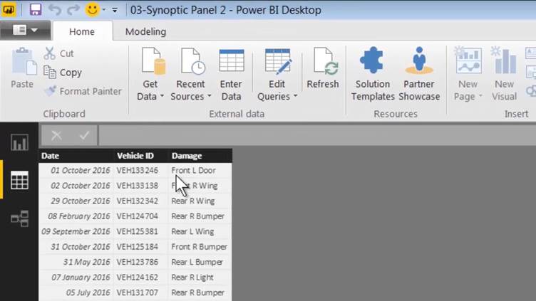
So far, we have connected to a data source and we now have these
two tables loaded into the data model available for building reports.

On the left, we have three views in which we can work. In
the illustration above, we are in report view, which is where we will be
building our report. Below report view, we have data view, which allows you to
look at the data within each of your tables.
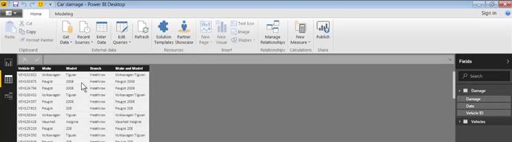
Simply click on the name of a table on the right to obtain a
data preview. For example, in the illustration above, we can see what's inside the
vehicle table; one of the two tables which we will be using to build our report.
Finally, we have relationships view, in which you can create
relationships between tables that have columns in common. Additionally, Power
BI can create these relationships for us automatically and, when we imported
our data, in part two of this tutorial series, this is exactly what happened.
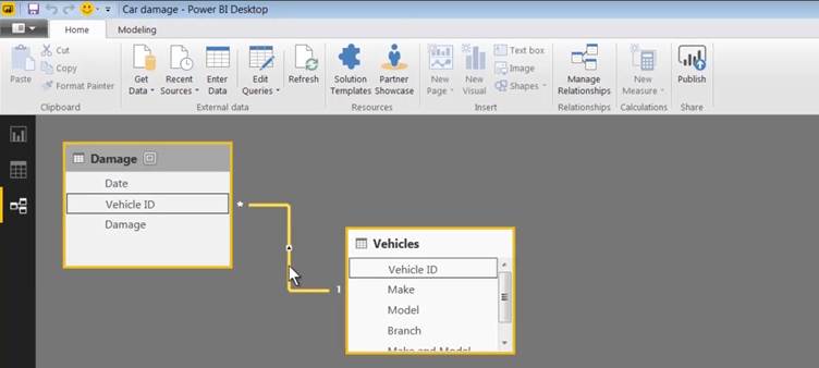
When we hover over the line joining the two tables (which
represents the relationship), we can see that the relationship was created
using in the vehicle ID, which has been recognised as the common column. Power
BI has automatically created the relationship for us and that's all we need for
this exercise.
In later tutorials, we will discuss the data model in depth
and we will go into more detail as to how relationships work and how you
create them manually.
So, for the moment, we can leave relationship view, return
to report view and go ahead and build our report.
We have a wide variety of visuals at our disposal and
additionally we can use custom visuals; and that's what we'll be doing in this
example.
Power BI custom visuals are visuals which have been
developed by either by Microsoft themselves or by the Power BI community and
made available free of charge to anyone who is using Power BI Desktop.
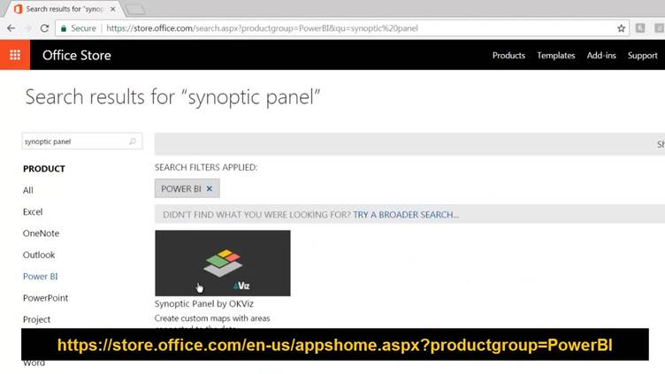
To access custom visuals, visit https://store.office.com and click on the
Power BI link on the left of your screen. You can then browse through the
visuals or enter the name of a visual in the search panel. The custom visual we
will be using (The Synoptic Panel) is already included in the tutorial folder.
To use a custom visual, we begin by importing it. To do
this, click on these three dots at the bottom of the Visualizations Pane; and,
from the pop-up menu, choose "Import a custom visual".
x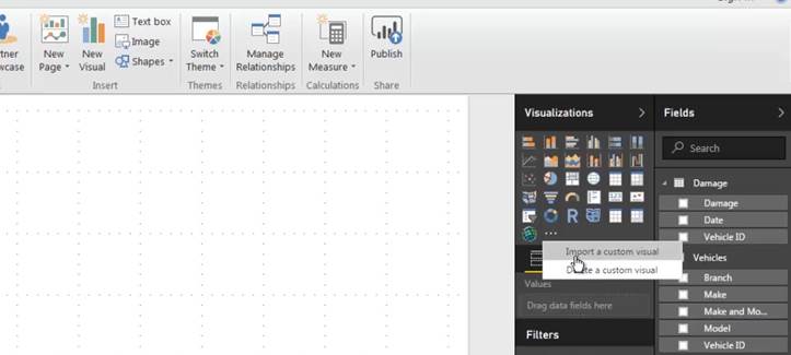
A warning message is displayed just to remind you that you're
using a feature which hasn't been created by Microsoft which is not an inherent
part of their product.
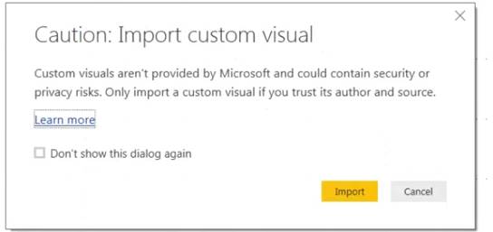
You may want to switch this message off by activating the
checkbox marked your "Don't show this dialogue again".
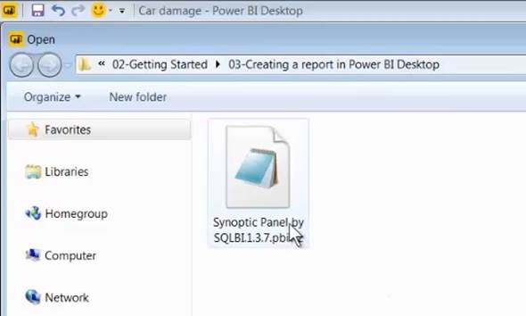
Click on import and, in the tutorial folder, you'll find the
Synoptic Panel which is the visual that we will be using. Simply double-click
on it to import it.
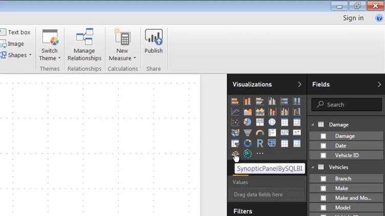
Once a visual is imported, you'll see a new icon, which
represents the imported custom visual, in the Visualizations Pane. To use the custom
visual, click on its icon.
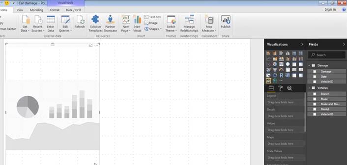
This gives you a blank tile which you can resize and
reposition as required and then populate with data from your various tables.
To get an idea of how the custom visual works let's look at
the completed report that we will be creating. (You will find the completed
version of the report in the tutorial folder.)
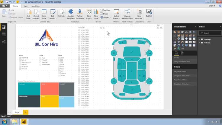
The Synoptic Panel custom visual is designed to display a
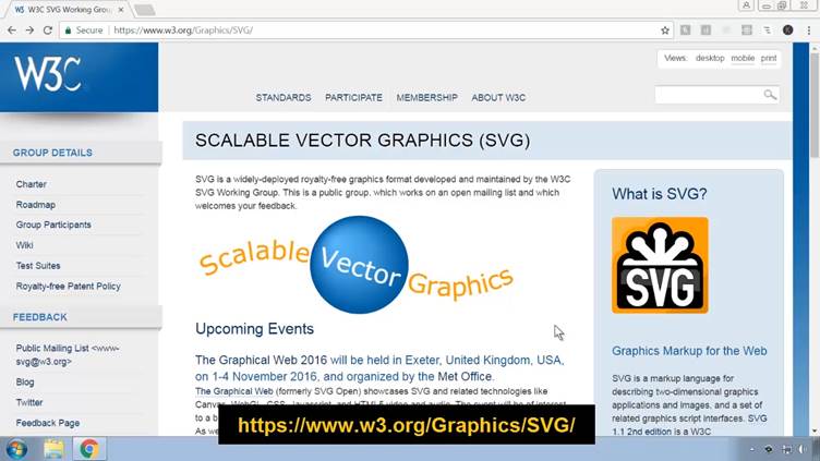
data driven graphic. The graphic has to be saved in SVG format. SVG (Scalable
Vector Graphics) is web graphic format which, unlike most web graphic formats,
is vector based.
This means that you can scale an SVG file to any size and it
is always going to be crisp and sharp.
The way that the custom visual works its magic is that it requires
you to create a correspondence between the fields within the SVG file and the
names within your dataset.
The correspondence that we are using in this example is
between the Damage column and the SVG. Thus, each of the areas which are
coloured actually has a name (an SVG ID) which corresponds to one of the names
that we can see in the damage column.
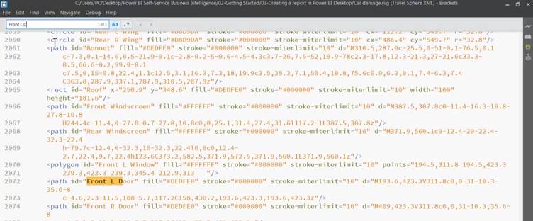
You can open the SVG file in any text editor. You do this by
right clicking and choosing open with any text editing program, such as
NotePad.
Once open, you will see that the SVG file is basically an
XML file which contains lots of coordinate-based definitions representing the
various geometric paths which the graphic contains.
If we do a search for one of the entries in the damage
column of our table, such as "Front L Door", we can locate the path
within the SVG file that corresponds to Front Left Door entries within our data
table.
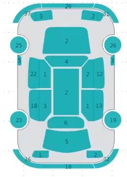
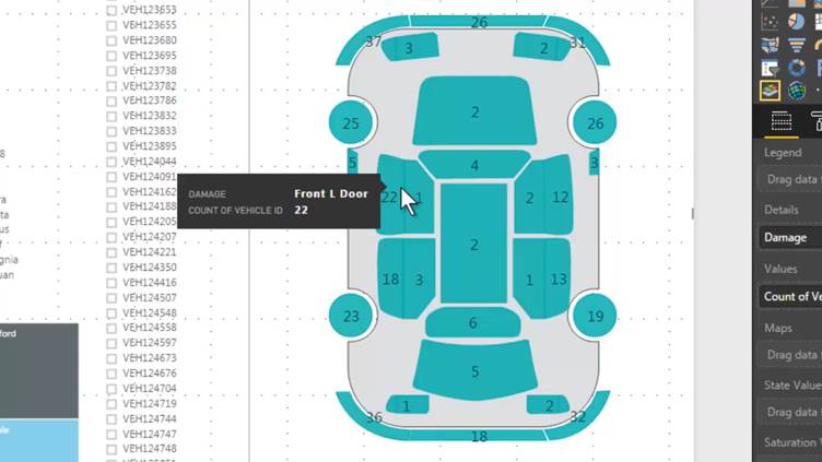
And, sure enough, if we go back to the report and hover over
front left door within the graphic, the tooltip displays "Front L Door";
and we can see that there is a total of 22 cars which have scratches on that
part of the car.
So that's a look at what we will be building and how it all works.
In the next part of this tutorial, we will build the report from scratch.