- You are here:
- Home »
- Blog »
- Power BI »
- Creating Mobile-Only Content in Power BI

Creating Mobile-Only Content in Power BI
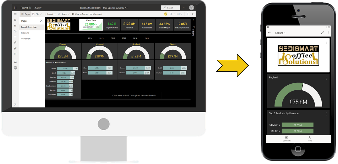
Mobile-optimized Reports
Mobile reports are based on the regular web report which you will have already created, with the layout adapted and optimized for mobile.
For example, adapting a four-column desktop layout into a single-column mobile one.
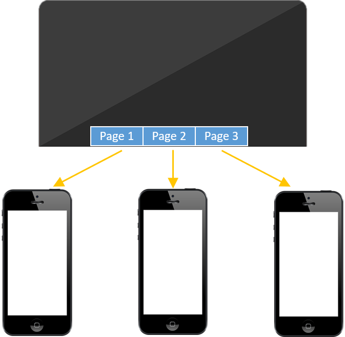
Page-by-Page Layout
Mobile reports must be designed on a page-by-page basis, with a separate design for each page, and the starting point for each page design will always be the visuals used on each page in the desktop layout.
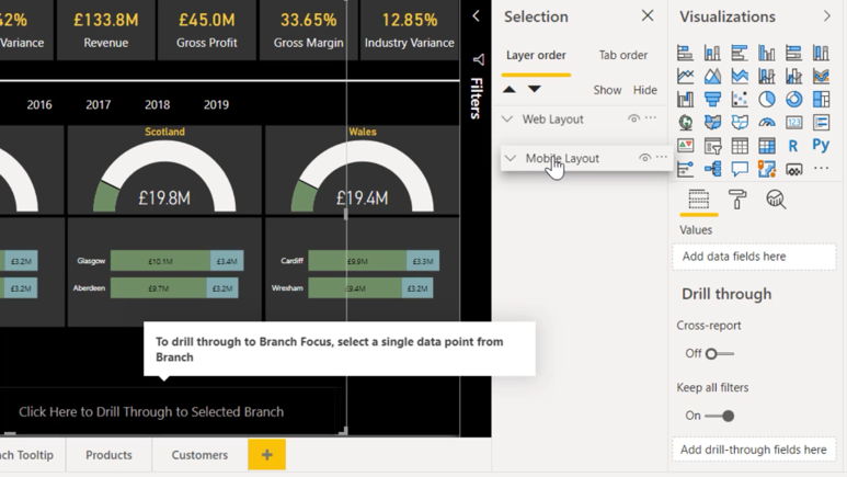
Organizing Visuals in the Selection Pane
The Selection pane (View > Selection) is very useful for organizing your page elements and demarcating web assets from mobile ones.
The visuals used in your web layout should be regarded as the originals and can be used in both web and mobile layouts.
However, any visuals (or visual arrangements) which are unsuitable for mobile display should be substituted, either by duplicating and modifying the web versions or by creating new, mobile-only alternatives.
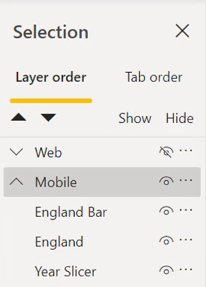
Grouping Visuals
When preparing a mobile layout, it is useful to create at least two groups of visuals: one for web assets and one for mobile-only assets.
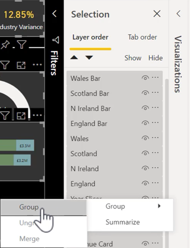
To create a group, in the Selection pane, use Click > Shift-Click (for contiguous selection) and Click > Control-Click (for discontiguous selection); then Right-click the selected elements and choose “Group > Group”.
Hiding Mobile-Only Visuals
If you need to create visuals for use on mobile only, you will need to hide these visuals in your desktop layout.
However, unfortunately, any visuals which are hidden using the Selection pane will be hidden in both desktop and mobile layouts. So, you will need to use a hack.
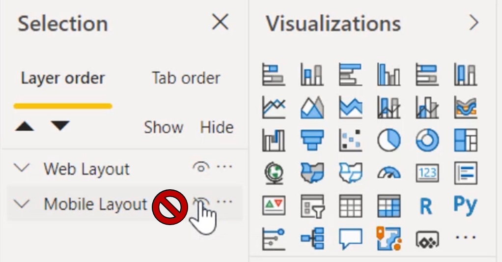
The first step to hiding mobile-only assets is to drag the mobile group below the desktop group, so that all mobile-only elements are at the bottom of the stacking order.
Next, highlight the mobile layout group and, in Format > General, set the width and height to 12 pixels each, the minimum allowed.
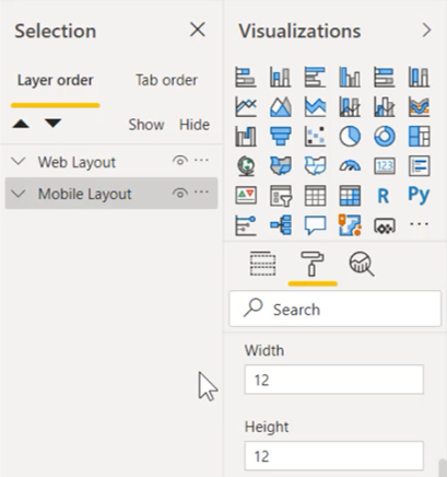
Since the group as a whole is only 12 pixels by 12 pixels, the individual visuals will now be tiny
As a final precaution, the mobile group can be positioned behind any visual in the desktop layout group which has a solid background.
Dragging the mobile group will now be impossible, so you will need to use Format > General and set the X and Y coordinates.
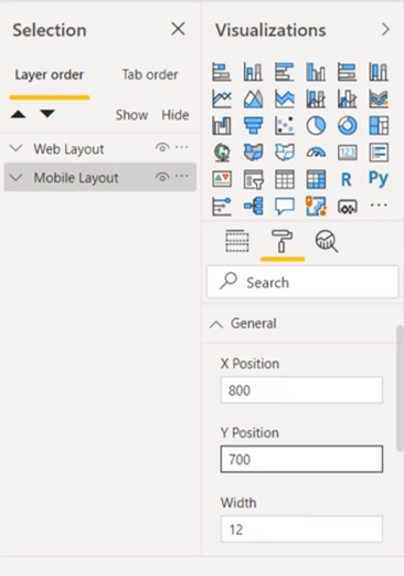
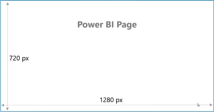
(The default size of a Power BI layout is 1280 x 720 pixels.)
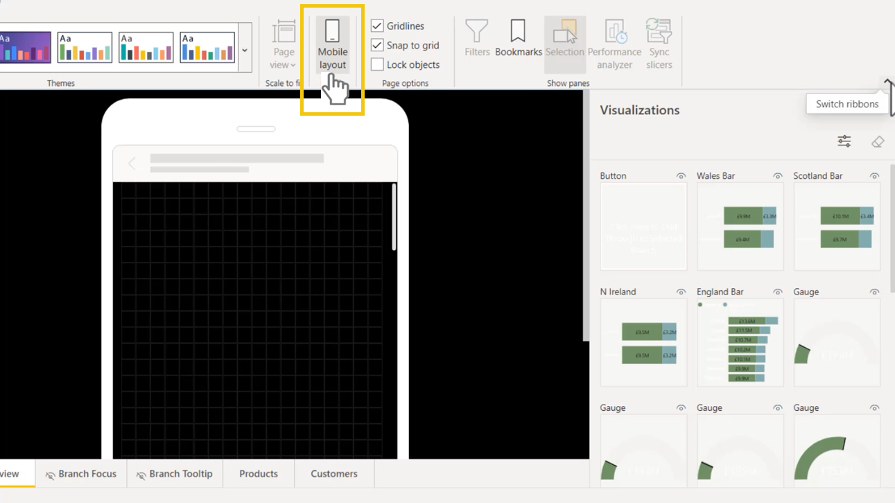
Creating a Mobile Layout in Power BI Desktop
To create a mobile report layout in Power BI Desktop, click View > Mobile Layout.
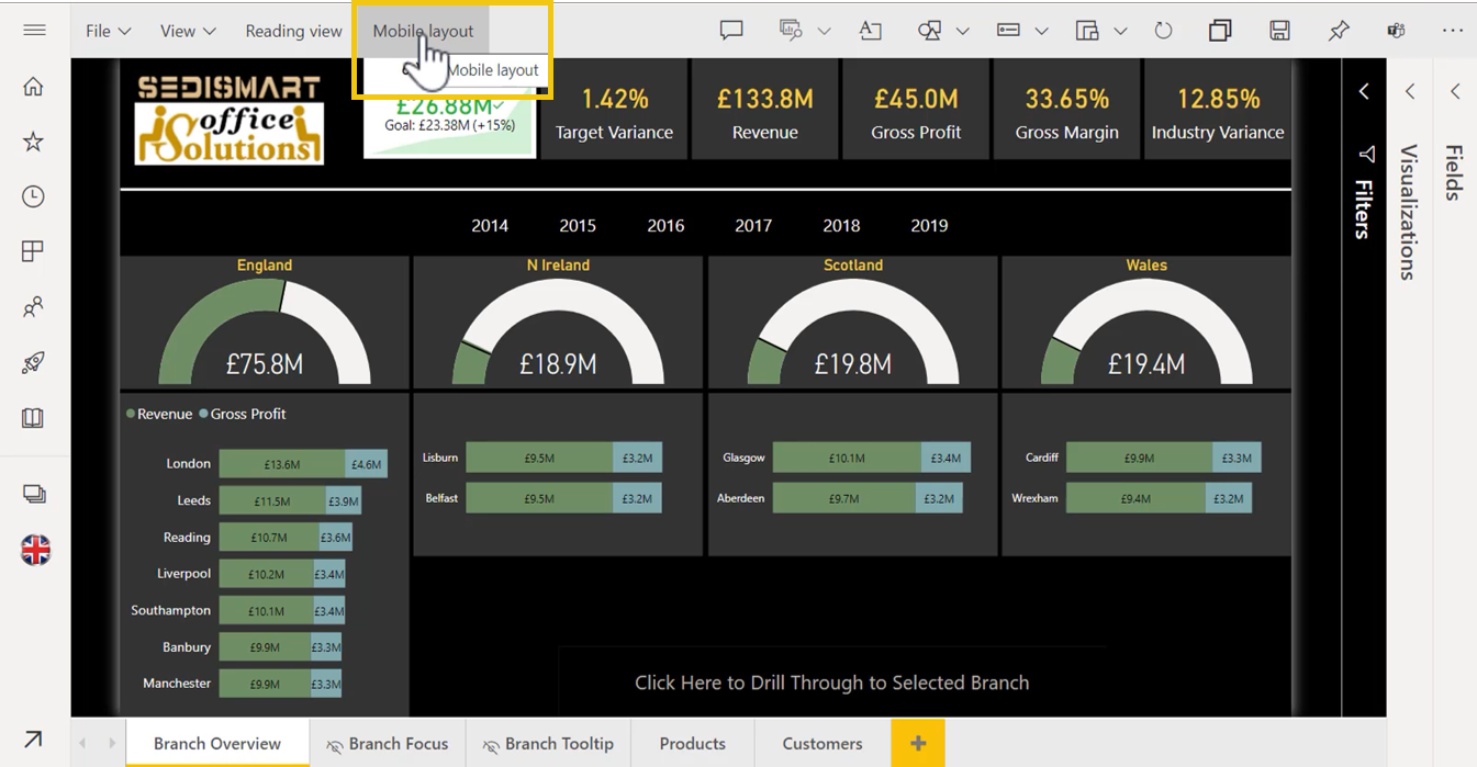
Creating a Mobile Layout in the Power BI Service
To create a mobile report layout in the Power BI service, edit the report, then click the Mobile Layout button.
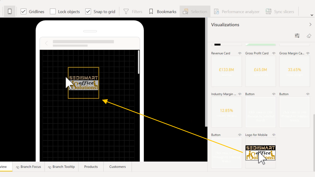
Adding Visuals to the Report Layout
To add visuals to the report page, either drag the visual from the Visualizations pane into the mobile preview or simply double-click the required visual.
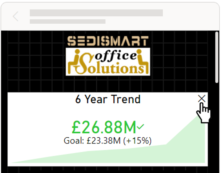
Removing Visuals from the Report Layout
To remove a visual from the report page, click on the “X” icon in the top right of the visual.
Mobile-Optimized Recognition
When accessing a report on a mobile phone, if the report has at least one mobile-optimized page, a special mobile icon is displayed next to the report name.
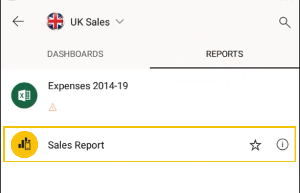
When the user clicks the report name to access the report, they will automatically be taken to the portrait report layout that you have prepared.