- You are here:
- Home »
- Blog »
- Power BI »
- Getting Started with Power BI – Pt 4

Getting Started with Power BI – Pt 4
Part 4 (of 4): Creating a Report in Power BI Desktop 2
Click here to download the tutorial work files
In the previous tutorial in this series, we discussed the use
of the synoptic panel custom visual to build a car damage report; and we
examined the completed report. In this post, we will build the report from
scratch.
Let's just recap the first steps…
To use a custom visual, we begin by importing it. To do
this, click on these three dots at the bottom of the Visualizations Pane; and,
from the pop-up menu, choose "Import a custom visual".
x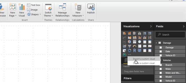
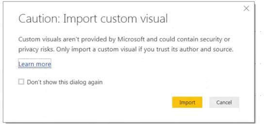
A warning message is displayed just to remind you that you're
using a feature which hasn't been created by Microsoft which is not an inherent
part of their product.
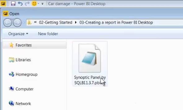
Click on import and, in the tutorial folder, you'll find the
Synoptic Panel which is the visual that we will be using. Simply double-click
on it to import it.
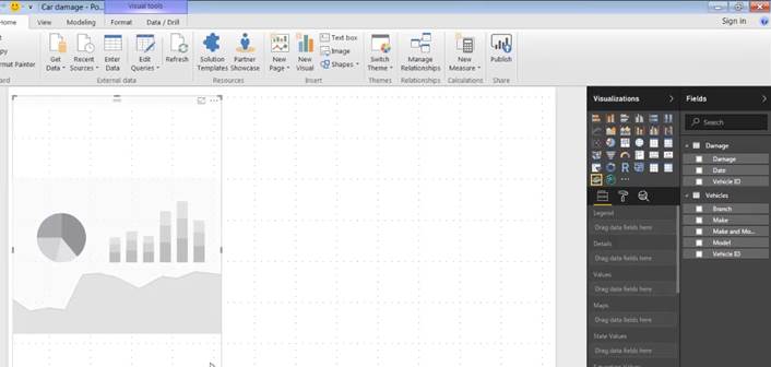
Once a visual is imported, you'll see a new icon, which
represents the imported custom visual, in the Visualizations Pane. To use the
custom visual, click on its icon.

This gives you a blank tile which you can resize and
reposition as required and then populate with data from your various tables.
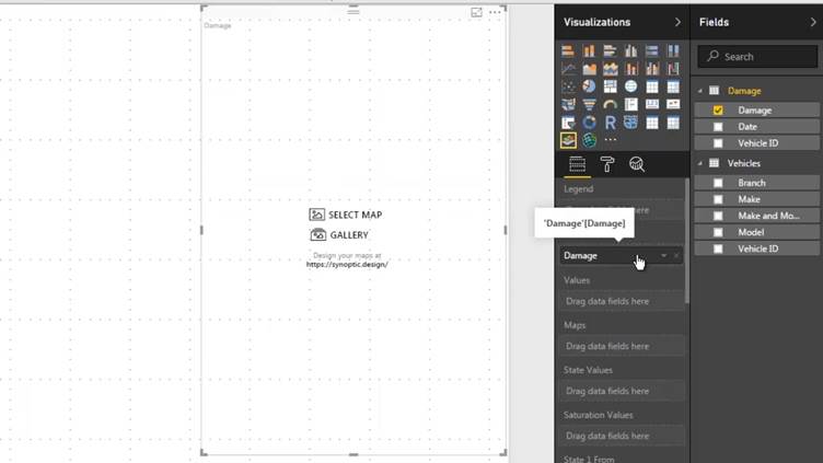
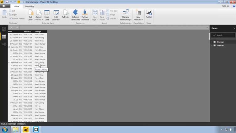
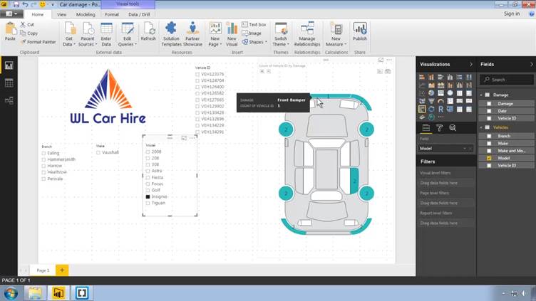
Our visual requires two fields: first of all we need the
Damage field from the Damage table to go into the Details field of the visual.
This is the field which will supply the text labels to be displayed on the
shapes indicating the different areas of damage on the car.
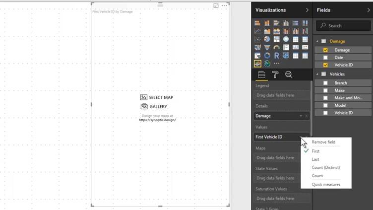
Next, we need to specify what we want to analyse; and what
we want to do is to count how many vehicles have damage on the various parts of
the car. To do this we can drag the Vehicle ID field from the Damage table into
to the Values field of the visual; but, the it is important to specify that we
want to count the vehicle IDs; so we can know how many cars have damage. We do
this by simply clicking on the arrow next to the field name in the Values field
of the visual and changing the default First to Count.
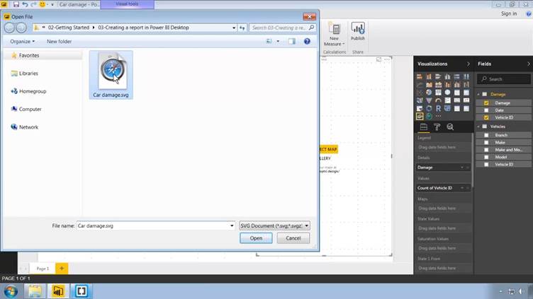
We now we need to get a graphic into the visual; and there
are a couple of buttons on the visual for this purpose: we can either select
the map (graphic) of our own choosing; or we can use a graphic from the gallery
supplied by the creators of the visual. In our case, want to select our own
map; so just click on the Select Map button, navigate to the download folder
and select our SVG file (Car damage.svg).
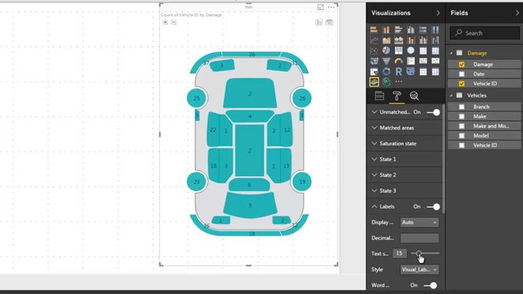
You will notice that the graphic has green areas
superimposed on it; the areas that are turning green indicate wherever there's
a match between the names within the SVG file and the various labels that we
have in the Damage column of the Damage table.
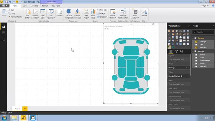
If you hover over any of these areas; you will see a tooltip
indicating the total count of how many cars have damage in that area.
So the numbers which are associated with each shape are simply
a count of the number of rows within the Damage table which have the
corresponding term in the Damage column; for example, the number of rows
containing the string "Front L Wing".
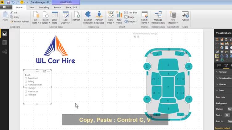
Let's complete visual by displaying the actual numbers
permanently rather than having to wait until you hover over each one. To do
this, in the visualizations pane, we switch over from the Fields Tab to the Format
Tab, switch the Labels option on and drag the Text size slider to make the
labels a bit bigger.
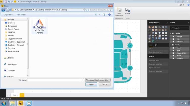
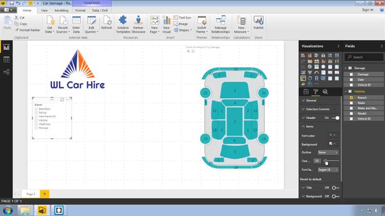
Next, we will add the company logo. To do that, in the Home
Tab of the Ribbon, click on Image and navigate to the logo, in the download
folder.
Finally, let's finish off by adding some slicers which will
enable the user to filter the amount of damage which is played on the car. If
necessary, make the visual a bit smaller to make room for the sliders on the
left. Then, to create the first slicer, make sure that nothing is highlighted
and click on the Slicer icon in the Visualizations pane; the icon with a funnel.
The first field by which we want to slice is Branch; so with the blank slicer
tile still selected, click on the checkbox next to the Branch field in the
Vehicles table.

Let us also make the text in the slicer bigger; so, again,
we go across to the Format Tab of the Visualizations pane and, this time, we expand
the Items section and let's make the text size 12 point, instead of the default
10.
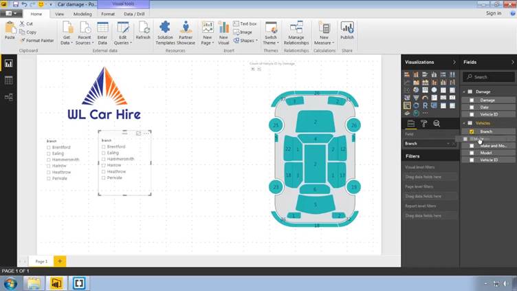
Next, let's create a second slicer to filter by the make of our
cars. To copy the existing slicer, there is no right click menu, so just type
Control-C to copy and Control-V to paste.
Then to change the field displayed in the copied slicer, you
need to drag the replacement field (Vehicles > Make) over the existing one
(Vehicles > Branch).
Next, we can Copy And Paste again and, this time drag
Vehicles > Model to replace the existing field. And let's then paste one
final time and replace the existing field with Vehicle > Vehicle ID, i.e.,
the individual cars.
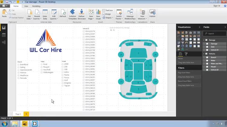
So we can now filter on all of these different levels; by
branch, by make, by model, or we can go straight down to a specific vehicle.
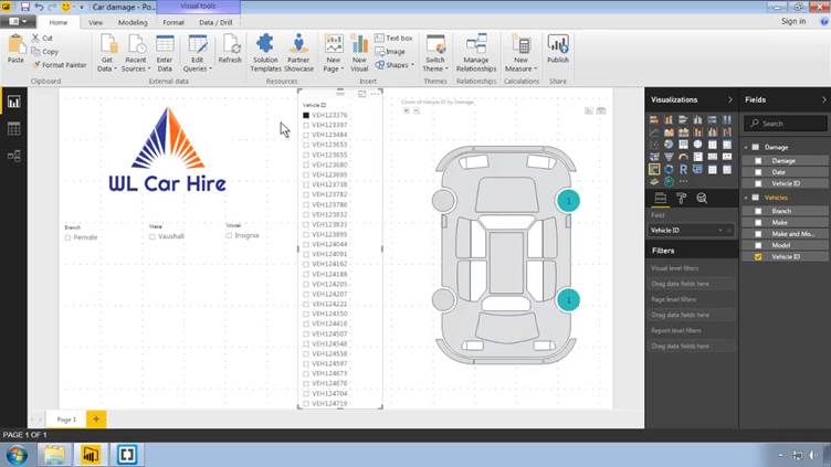
You will notice that the filters are automatically; thus, in
the example above, the particular vehicle that has been selected happens to be
a Vauxhall Insignia based at the Perivale branch.
And, in the example below, the tooltip is displaying the
total number of cars which have damage to the front bumper.
That's it for this series of posts. Don't forget to save your changes,
if you are following along and performing all the steps.