- You are here:
- Home »
- Blog »
- Power BI »
- Power BI DA-100 Exam Tips
Create reports
Design and configure for accessibility

Power BI DA-100 Exam Tips
Create reports
Design and configure for accessibility
In this series of blog posts, we will be examining some of the key features of Power BI Desktop, Power Query and the Power BI Service needed to pass exam DA-100: Analyzing Data with Microsoft Power BI.
In this Power BI training post, we will examine DA-100 exam – Create reports: Design and configure for accessibility.
Design and configure for accessibility
This topic is designed to test your familiarity with those features which are designed to make your Power BI reports accessible to all users, including those who are using screen readers, and who may have visual impairments.
Colour Schemes
Accessible Themes
Let us start by looking at colour schemes and things that you can do to ensure that everyone who looks at your report is able to get the information that they need, based on the colour scheme that you have used to communicate that information. The key feature that you need to use here is Power BI themes. If you work at the theme level, then you can make global changes throughout your entire report. If you get into the habit of using one off colours, rather than theme colours, then, obviously, when you come to edit those colours, you have far more work to do.
To work with themes, we go to the View tab, and here we have a series of built-in themes, and in fact, Power BI includes a couple of themes, which are specifically designed to improve accessibility. So, here we have a high contrast theme, and then we also have a colour-blind safe theme.
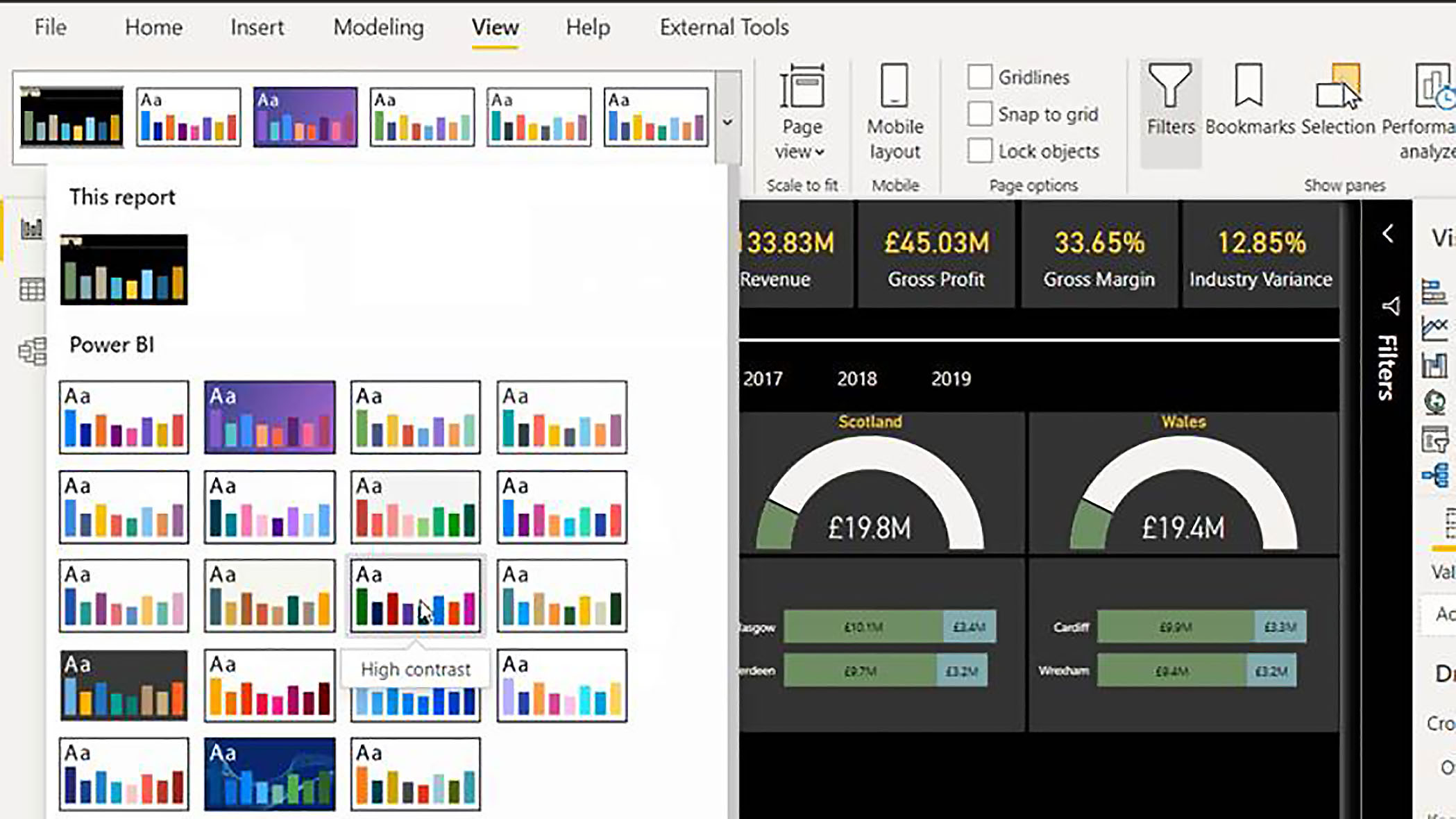
So, depending on the guidelines or standards to which you are adhering, you may find either of these are a useful starting point when you are customising your colours to make your reports more accessible.
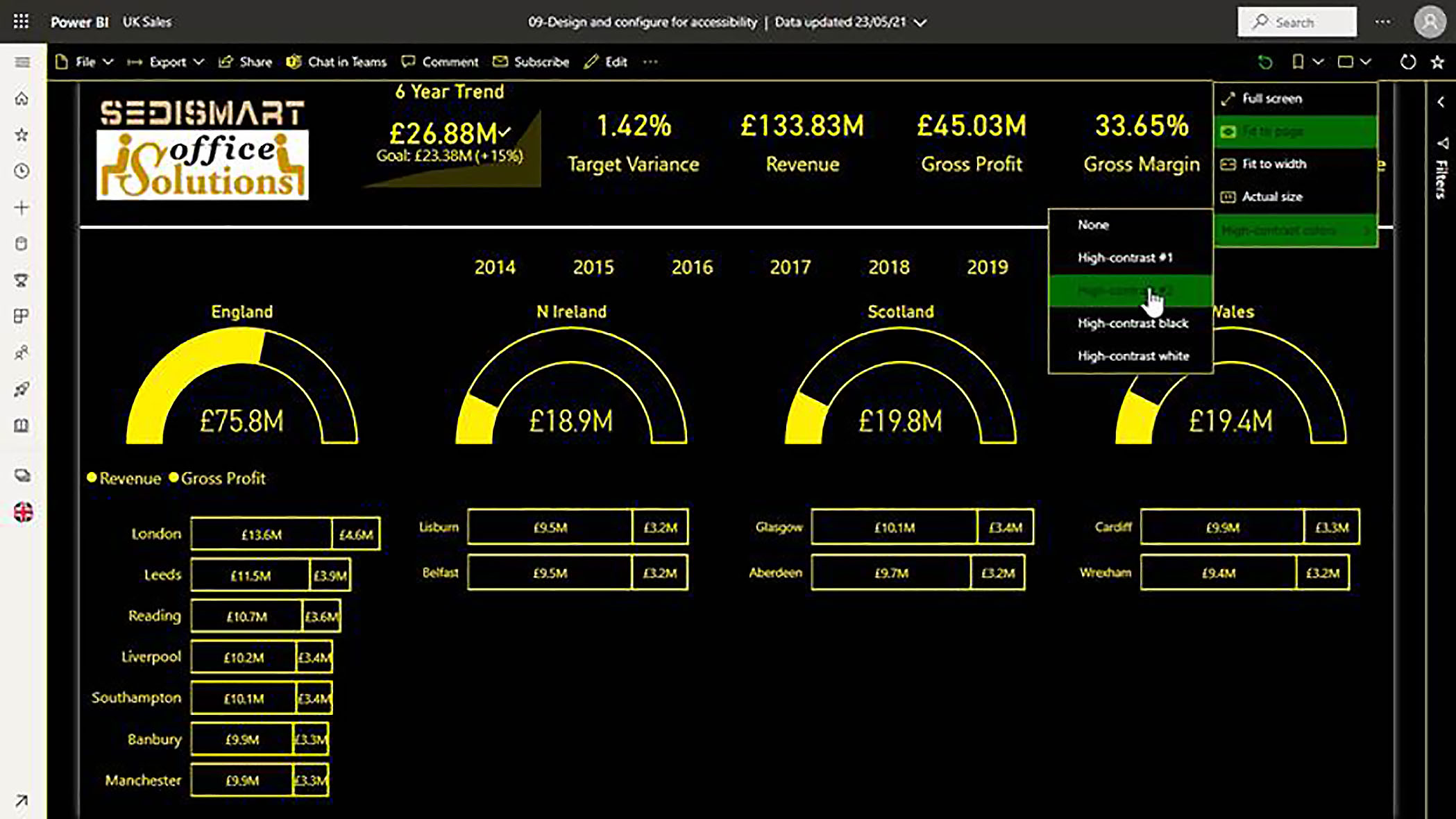
Choosing Accessibility Options in the Power BI Service
These features are obviously designed for report developers. However, additionally, there are features available in the Power BI service for report consumers. So, when a user is looking at a report, they can always click on the View menu and choose high contrast colours, and then they have a few high contrast themes to choose from, and these are automatically available for all reports. So, we have high contrast, one, high contrast two, high contrast, black, and so forth.
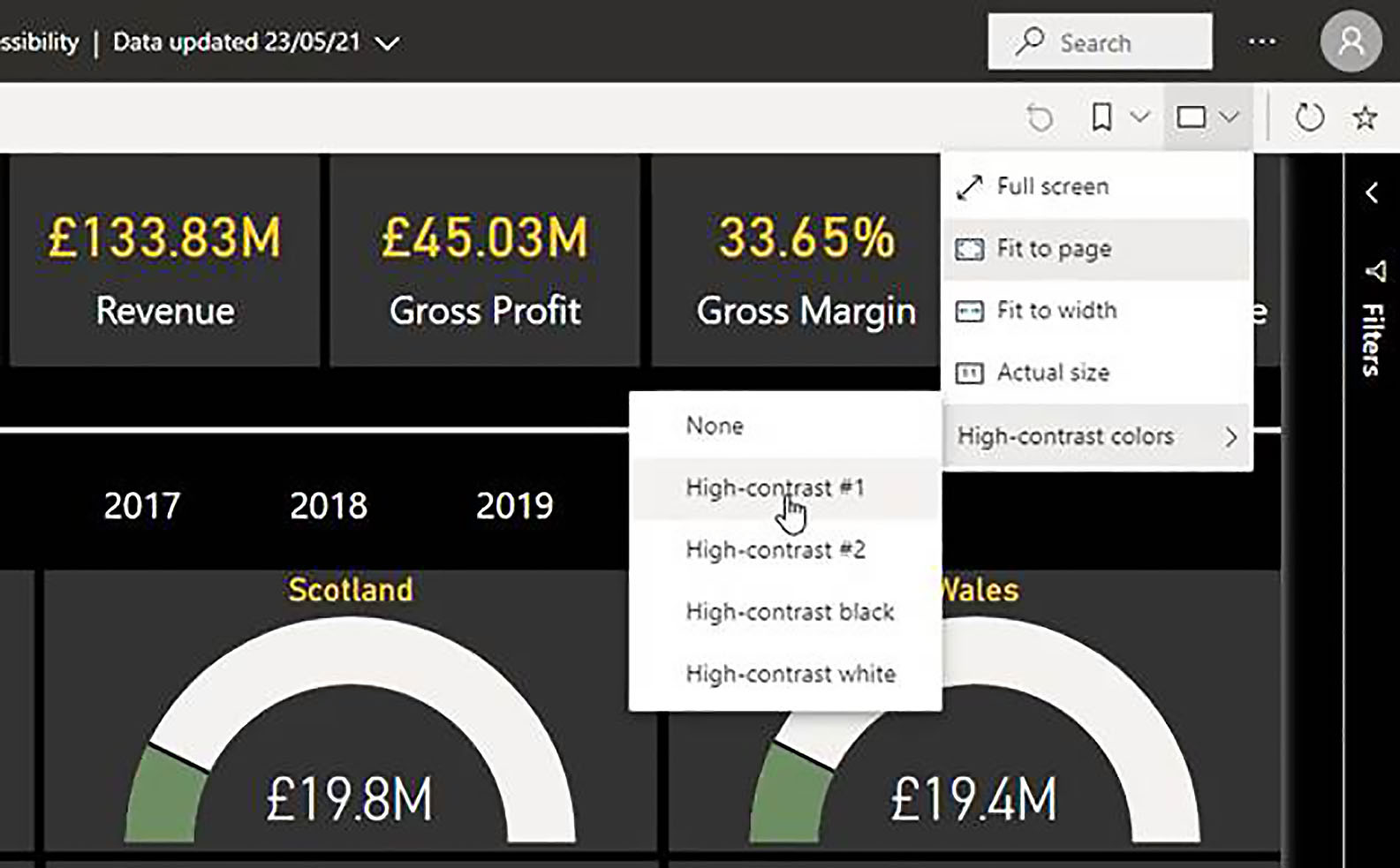
So, if colour does not play a hugely important part in your reports, one thing you might consider doing is simply making your report consumers aware of this feature. So, if they prefer to work in high contrast mode, they can do so.
Increasing Colour Contrast
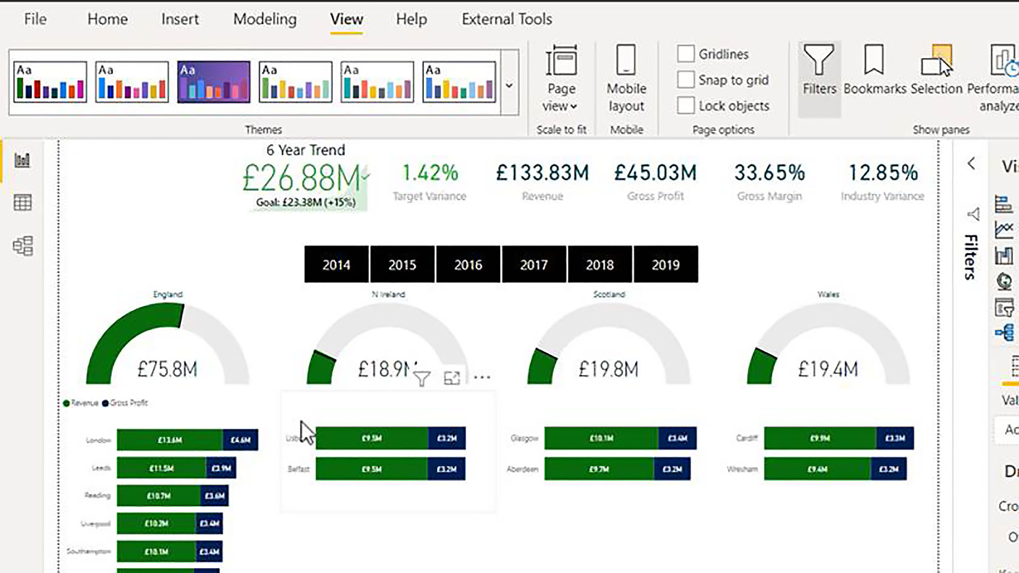
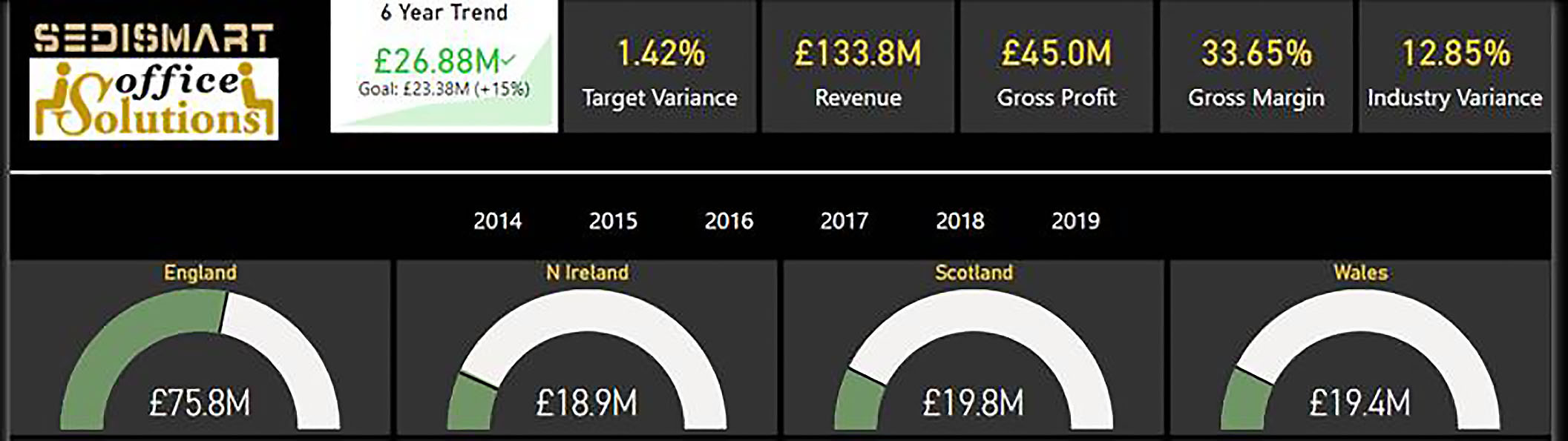
If you yourself want to increase the contrast of the visuals that you will use in the foreground colours, versus the background colours, there are websites that you can visit to check this scientifically. However, you can also just use common sense. So, in the following example, if we look at the data labels on the cards and the gauge titles, it is probably borderline as to whether there is sufficient contrast between the text and the background.
So, one thing we might do is customise the current theme, and we do that by clicking on the drop-down and choosing Customise Current Theme.
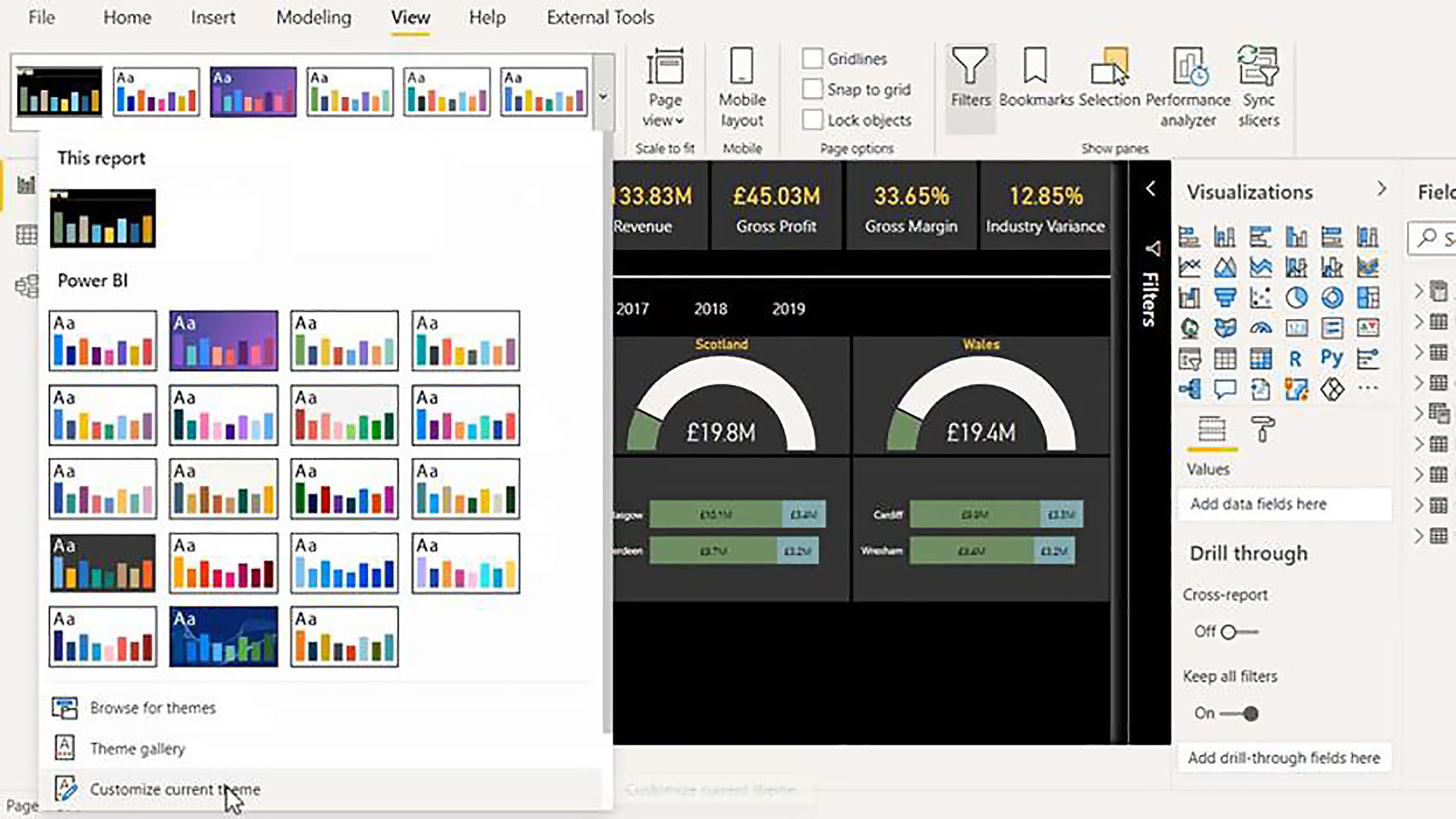
We can then see the benefits of using theme colours. The text colour that is used for the data label colour, and also for the title colour on these gauges is actually theme colour number five. So, if we change Theme Colors > Color 5 to white, then without checking scientifically, we can be confident that we now have sufficient contrast between the foreground colour and the background text.

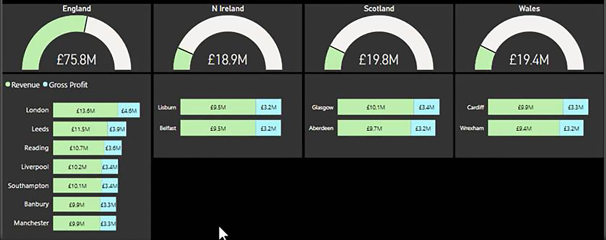
Another area where we have borderline visibility is the black text on the slightly dark green and blue, in the bar charts.
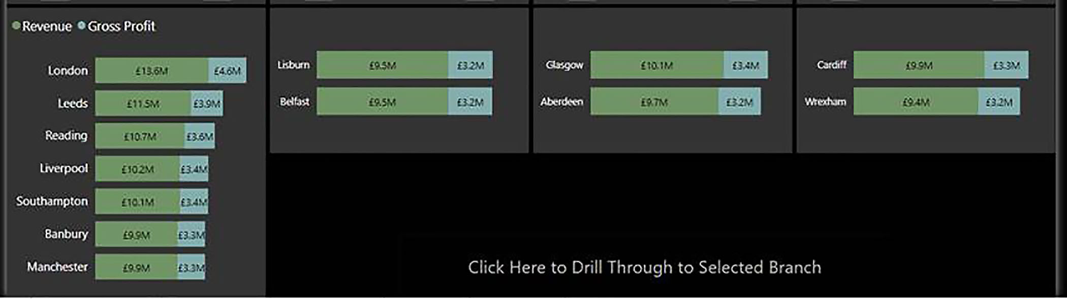
So, again, we can customise the current theme, and again, we are talking about theme colours. So, the green is theme colour one and here we can simply make that a lighter green, and then do the same for the blue. Just make it a much lighter blue.

So, when we apply, we now have black text on lighter background colours, and again, we can be fairly confident that there is sufficient contrast in the colours.
Tab Order
Another important aspect of accessibility is what is called the tab order, and this is very important for anyone who is using a screen reader. Screen readers allow users to access the elements within your report by pressing the tab key, and of course, the order in which items are accessed needs to be logical.
Usually, you want the tab order to be pretty much identical to the order in which items are laid out on the page. To improve the logic of the tab order, we go into the View tab, and click on Selection, and this opens the Selection pane. Here, as well as Layer Order, we have Tab Order.
So, the first item at the top is going to be our six year trend, then we want the target variance, then Revenue, Gross Profit, and so on. To rearrange the tab order, we just drag items up and down within the Selection pane.
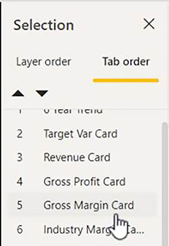
In summary, all you need to do is to have a logical tab order, which matches the layout on the page; and this is all done in the Selection Pane.
Alt Text
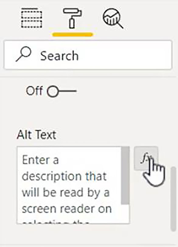
The other key element that you can use to make your reports more accessible is alt text. If you have done any web development, you will be familiar with this. Images typically will need an alt text attribute to inform screen readers what the image consists of. To access alt text, you highlight the visual, go into the Format tab of the Visualizations pane (the paint roller) and into the General section, and at the bottom, you will see a box where you can insert either static text, or you can click on the fx button, prepare a measure, and then choose the measure as the alt text.
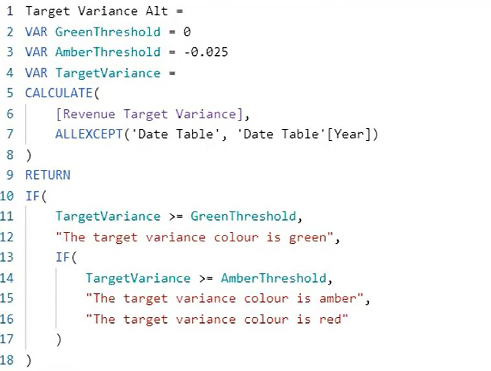
The first thing to point out is that, unlike web development, do not feel that you have to put alt text on every single visual. You only need alt text if there is some additional information which is not communicated in the visual itself. So, one example would be on the Target Variance card; we have a RAG colour scheme: red, amber, or green. This information will not be picked up by screen readers. So, this is an example of something that you will need to append as alt text.
So, we create a new measure which tests the Target Variance and outputs a message confirming the colour: "Colour is green", "Colour is amber", or "Colour is red".
In the General section of the Format tab, instead of static alt text we are using dynamic. So, we click on the fx button.
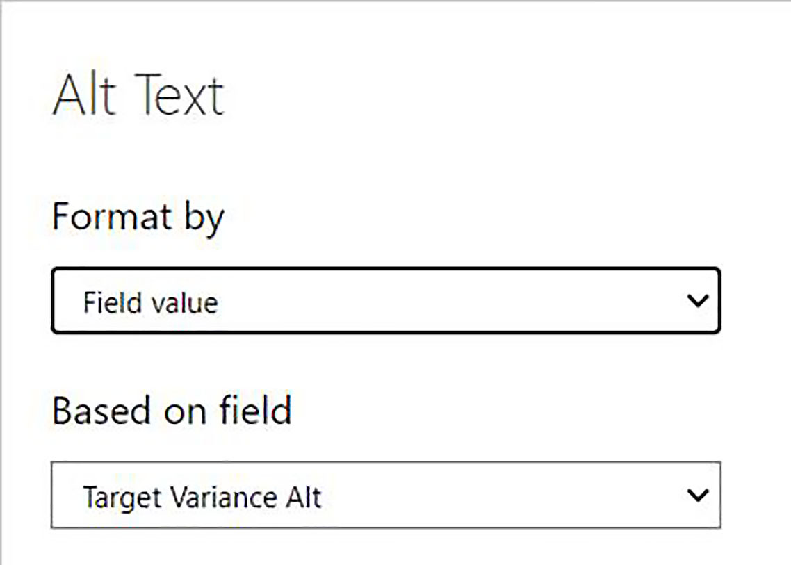
Then, in the Alt Text dialog box, we choose Format by Field Value, and then Based On > Target Variance Alt (the measure we have just created).
So, these are the key aspects of Power BI that you need to be aware of which related to accessibility.